Google Webmaster Tools Updates Search Queries Reporting
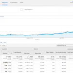
So for those of you who live inside of Google Products like we do here at The Miami SEO Company, you may have noticed that Google Webmaster Tools is replaced the Search Query Report with a brand new reporting tool to track search queries called “Search Analytics (beta)”. A snap shot below shows the reporting dashboard after clicking on the “Search Analytics” link from the main menu on the left side of the screen when logged into GWTM’s.
What’s New With The Search Analytics Update?

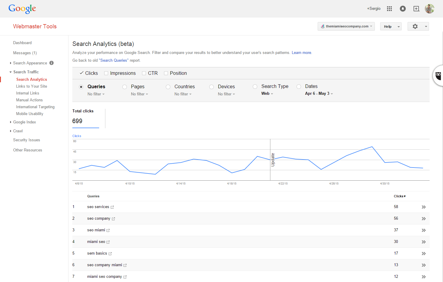
I’ve been messing around with the new features of this search query analysis reporting tool and I have to say, I like it. I like it a lot. 🙂 There are a ton of great new features that are available such as being able to compare date ranges and tons of new ways to implement segmentation. I thought I’d review the tool for everyone on our blog today so that those that are not privy to the update become aware of the great new features. One of the key benefits of the newly improved search analytics reporting tool include tracking average position and CTR on the linear graph. This is particularly useful for those that are keen on visual reporting as you are able to drill down on particular keywords or landing pages to see individualized performance of those keywords or landing pages based on average position over time.
![]()
You can even get fancy and add more than 2 lines on the graph now by clicking on the check box options above the linear graph. The options are clicks, impressions, CTR and position.
![]()
Additionally, just under the set of check boxes that represent your linear graph tracking options you can also use the radial buttons to toggle between viewing search query data, landing page data, country data, device data, search type data and date ranges. Each option has a drop down which you can use to filter segmented data if you want to really drill down deep into a particular subset of data. For example, you can drill down on one particular landing page to see how it performed based on impressions and position for the last 90 days using the “pages” radial button and then adjusting the date range. Below is an example of a 90 day report showing impression + position data on the linear graph for one particular page (our web design page). When you click on the pages radial button by default the linear graph will show data pertaining to all landing pages (the average). To drill down on one landing page’s data, all you need to do is click on the landing page from the pages list under the graph.
![]()
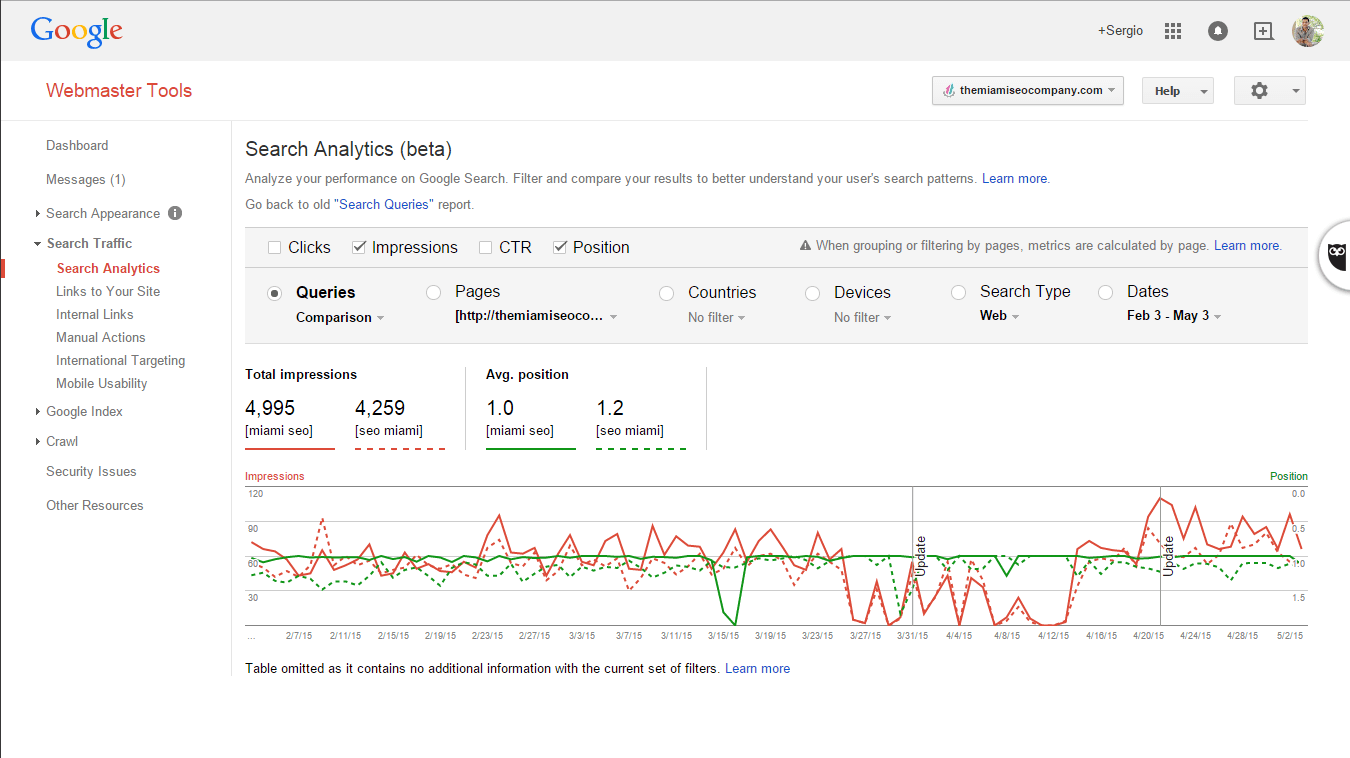
Another really cool option that is now available is the option to compare data. After you drill down on a search query by click on one from the queries report, you can click on the drop down for “Queries” and you will see a “compare queries” option. If you click on that, you will see a “Compare Queries” window pop up where you can enter the second query that you wish to compare your first one to.
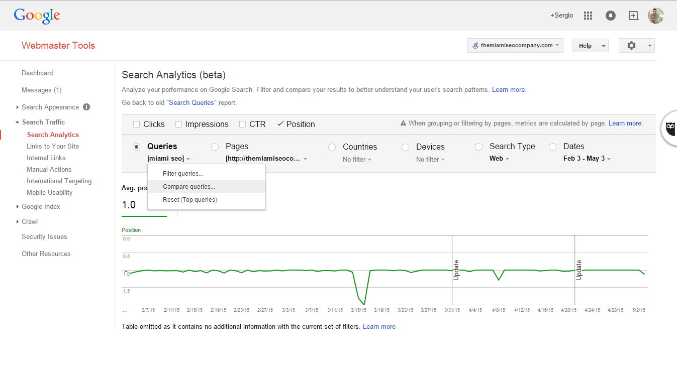
Below is an example of the pop up window where you need to enter the second keyword, in this example, I am going to compare “seo Miami” to “Miami seo” to see the difference in performance.
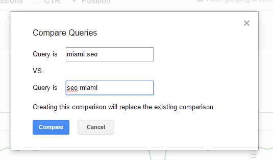
After entering my compare to search query and clicking on “compare”, out came a very easy to digest report comparing the average position of two keywords over time (according to the date range I had set). This is really neat in my opinion as my clients tend to be visual learners. The solid green line represents the performance of the first keyword, the dotted line reflects the performance of the “compare to” keyword.
![]()
Whats even neater is that you can apply multiple graph points, each one will have a uniform color according to which data points you track but the compare to search query (or landing page) will show up as a dotted line so that you can visually distinguish the two performance lines.
The Take Away From The WMT’s Update?
All in all, I think the update is great. It’s worthy to note that this is currently in beta and could possibly not last so don’t count on it sticking around forever. I can definitely see our project managers using this tool while consulting with their clients going over progress of organic efforts. Now that there are so many options to learn visually, I feel that our clients will be able to comprehend more and not become bored with the mundane reporting tables that are usually presented. I look forward to seeing how this transitions from beta into production indefinitely.
About The Author

Jason Hawkins / http://www.themiamiseocompany.com
Jason Hawkins is the CEO & Co-Founder of The Miami SEO Company. He has over ten years of experience in search engine optimization, conversion rate optimization and lead generation. His core responsibilities include identifying ways to increase value of services rendered, training staff on advanced SEO topics, and A/B testing internal processes to consistently improve client return on investment.